
Chicago based web designer & illustrator. I create and build websites for people and brands. I am available for freelance, just get in touch with me.
Chicago based web designer & illustrator. I create and build websites for people and brands. I am available for freelance, just get in touch with me.

This is actually the 3rd generation of the original logo I created in 2001. The original color scheme was royal violet and gold, however I dropped the gold and used white to make it more simplistic and clean. I chose to make the symbols lowercase while the T is lifted above them and doubles as the letter T and the symbol of a cross.
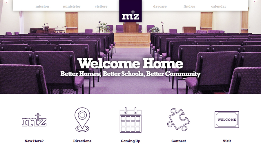
This is the 3rd generation website I had the chance to create for the church. Check it out.
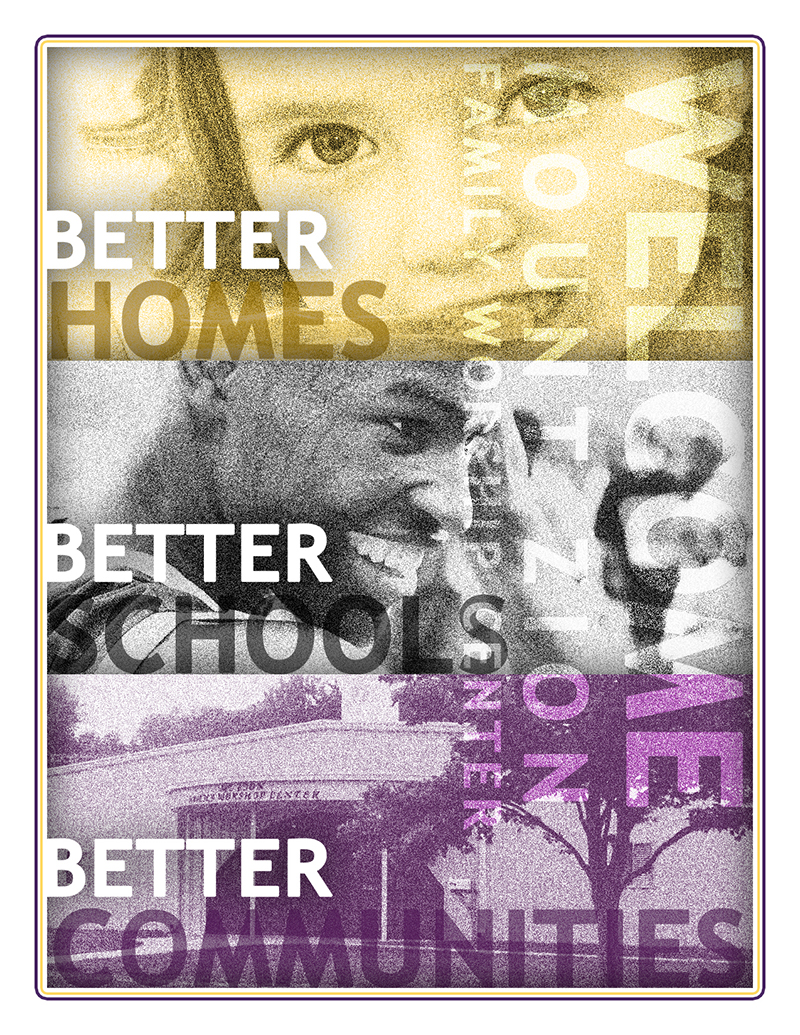
This was actually a mailer card with standard US postage space on the back and printed on a heavy card stock. I wanted to show models to convey a more personal appeal and then incorporate the actual exterior of the church that the community might recognize.
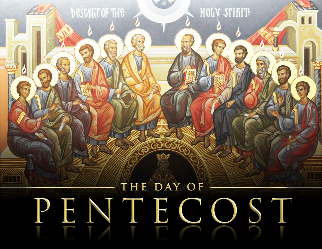
This celebration is widely known and a classic image of renaissance with a roman typography was enough balance of simple yet direct.
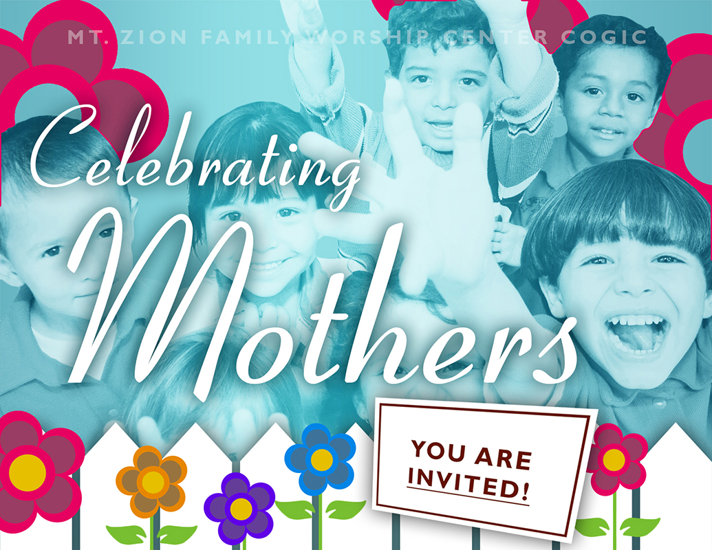
They have a daycare at this particular location and so there’s a lot of emphasis on children so I thought it would be good to show them happy and joyful for the holiday.
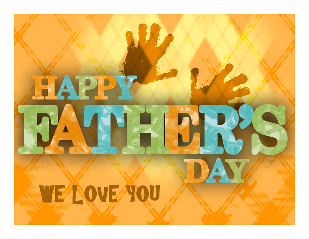
I love recreating ads for the holidays over and over, and they wanted to keep the flyers simple and friendly. No over-selling.
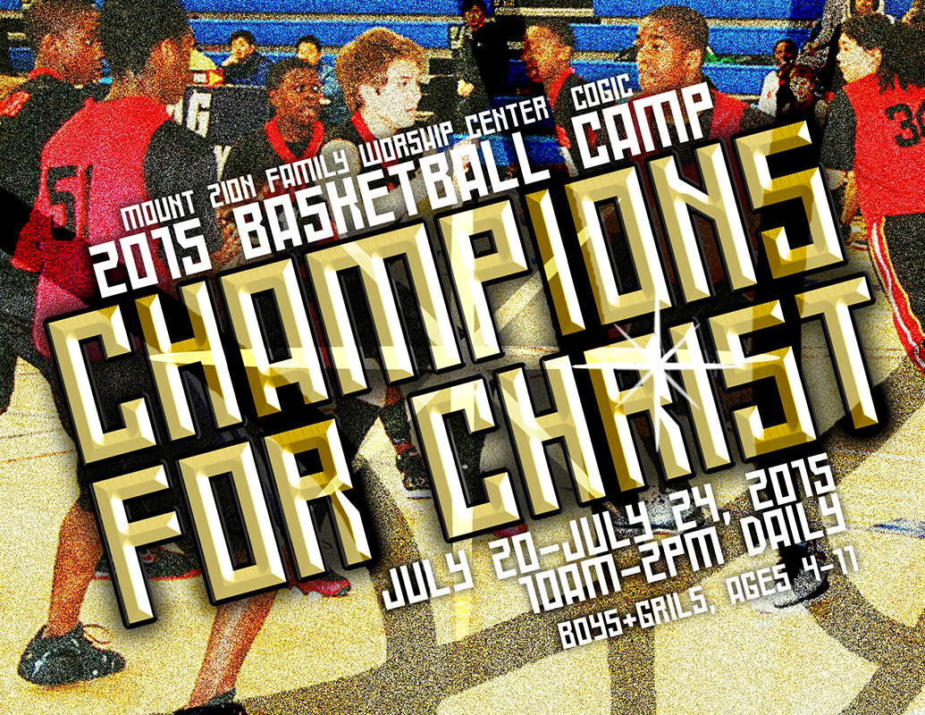
This was summer camp for boys and girls, and I wanted to give it a pro, NBA spin.
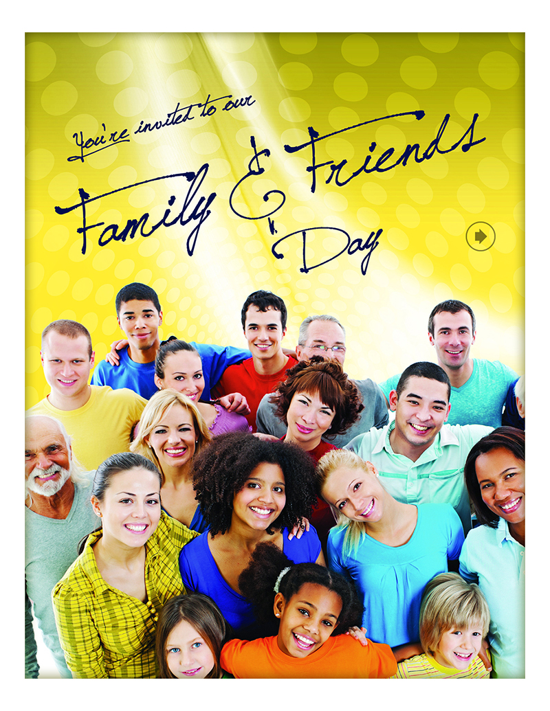
Happiness and fellowship was the goal with this. The organization emphasized that they wanted to see multiple racial backgrounds in every image in their branding.
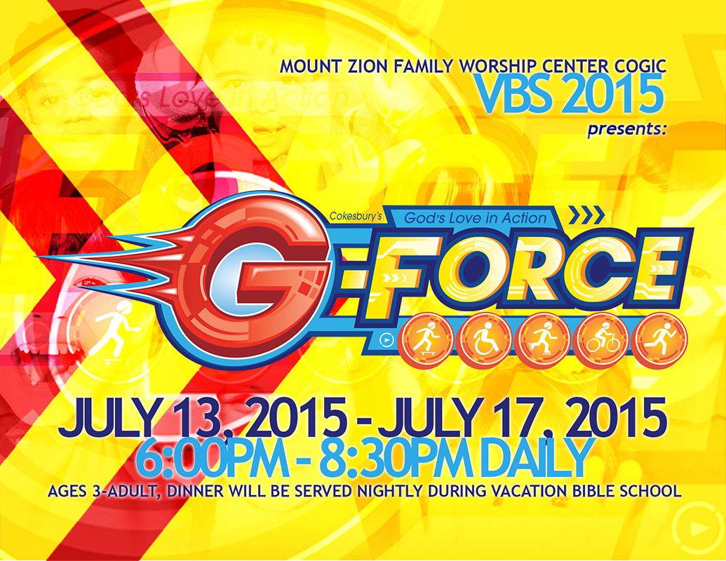
I love any excuse to use a primary color scheme, and although they supplied this mini logo, I used added light blue to make it more innocent and inviting.

I know students love to see the particular items they were offering so why not put them up front. I wanted the card to almost feel like a voucher or coupon for free stuff.
 Logo
Logo Website
 Flyer
Flyer