Chicago based web designer & illustrator. I create and build websites for people and brands. I am available for freelance, just get in touch with me.
Chicago based web designer & illustrator. I create and build websites for people and brands. I am available for freelance, just get in touch with me.


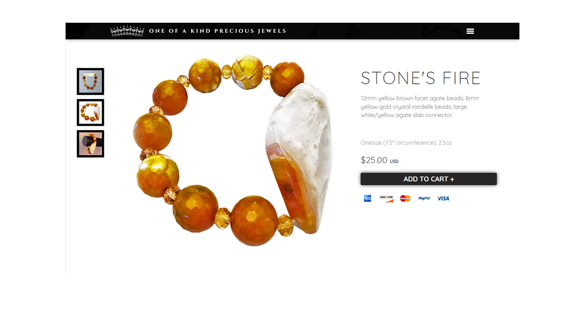
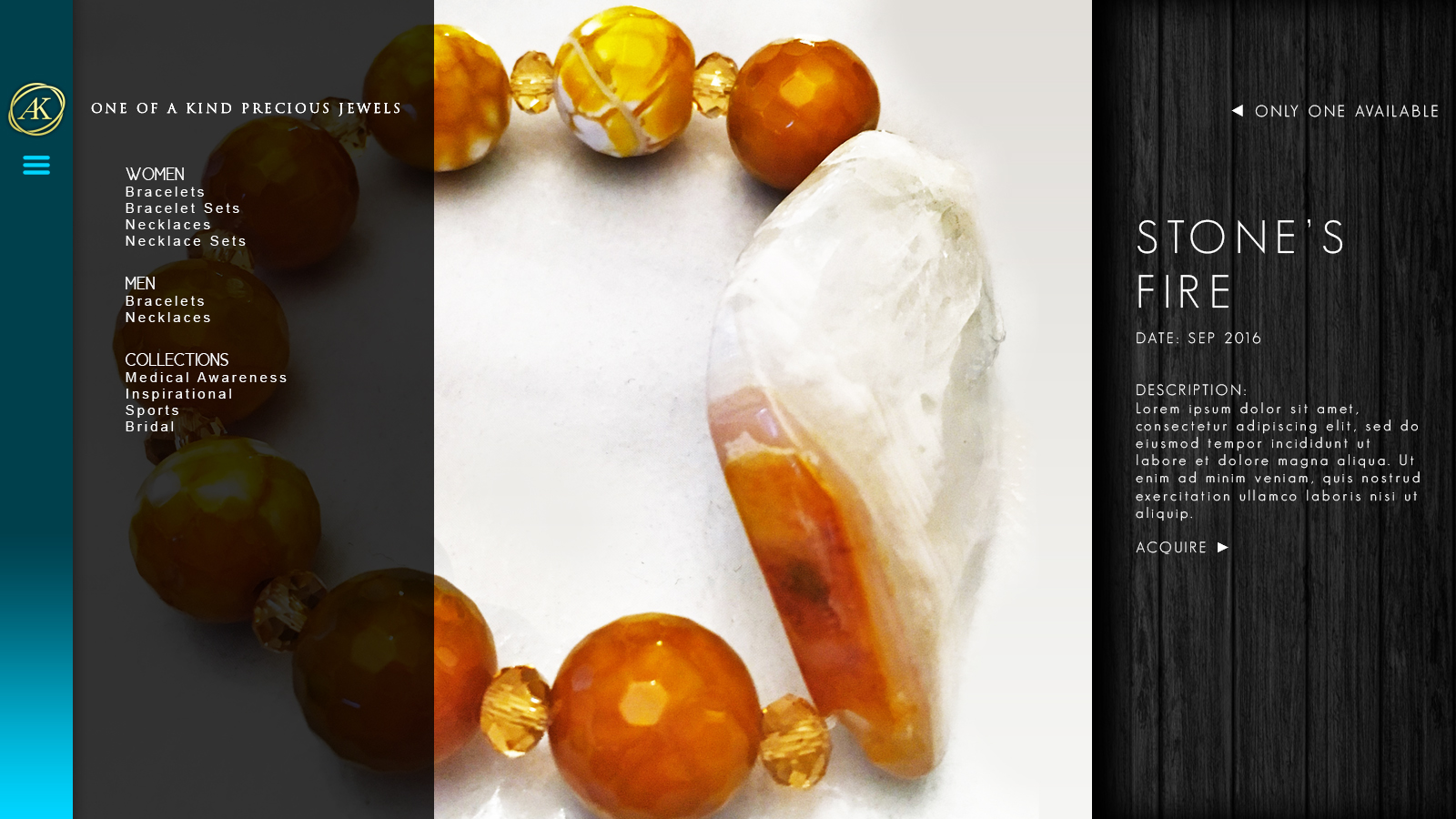
I photographed the product photos of the site. The focus would be creating an experience where visitors can immediately see great photos that showcase high-quality gem work. We dedicated a lot of real estate to a variety of hi-rez photos. We wanted users can get a very good sense of what every gem was, its colors, translucency, and its actual size to encourage concrete purchases while establishing the brand.
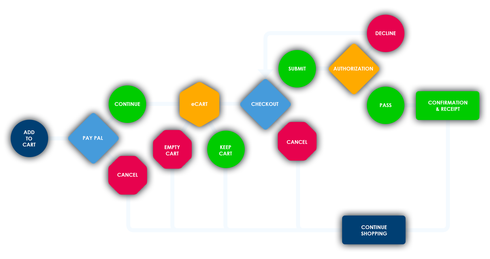
When a user adds the item to the cart, they are immediately assured that the purchase is powered by a secure pay site and met with the option to continue or cancel and return shopping. In the event the user selects to continue, they are transferred to the pay site, with the item in the cart and all information is congruent. There, they’ve the option to continue shopping or checkout.
After the checkout is initiated, they have the option to cancel at any point and smoothly transfer back to the website’s cancellation page. After the purchase is completed, they are transferred back to the website’s success page where they are congratulated for a fun and successful purchase and receive information about when to receive their package and where to find their receipt. There’s also an immediate choice to return to the homepage and continue shopping.
In the event a user is transferred to the cancellation page, they receive a message assuring that the purchase is cancelled. And then a message about the items available for purchase and a link to continue shopping.
In a very rare case, multiple users could attempt to purchase the same item at the same time. In this case, the first user to complete the purchase receives the item and is transferred back to the success page. However, the subsidiary users to attempt to purchase a freshly sold item are transferred to the sold-out page. There, they are met with an apology for the item being unavailable and an explanation of what as occurred. They are then met with a suggestion to continue shopping.
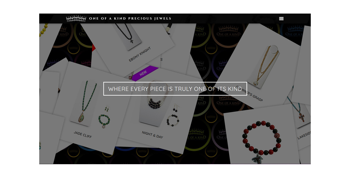
I’d debuted the landing with the first, gold logo. I wanted to be sure to emphasize the beautiful creations, however the landing page resembled a product page and didn’t give the clearest idea of a jewelry store with a wide variety.