
Chicago based web designer & illustrator. I create and build websites for people and brands. I am available for freelance, just get in touch with me.
Chicago based web designer & illustrator. I create and build websites for people and brands. I am available for freelance, just get in touch with me.
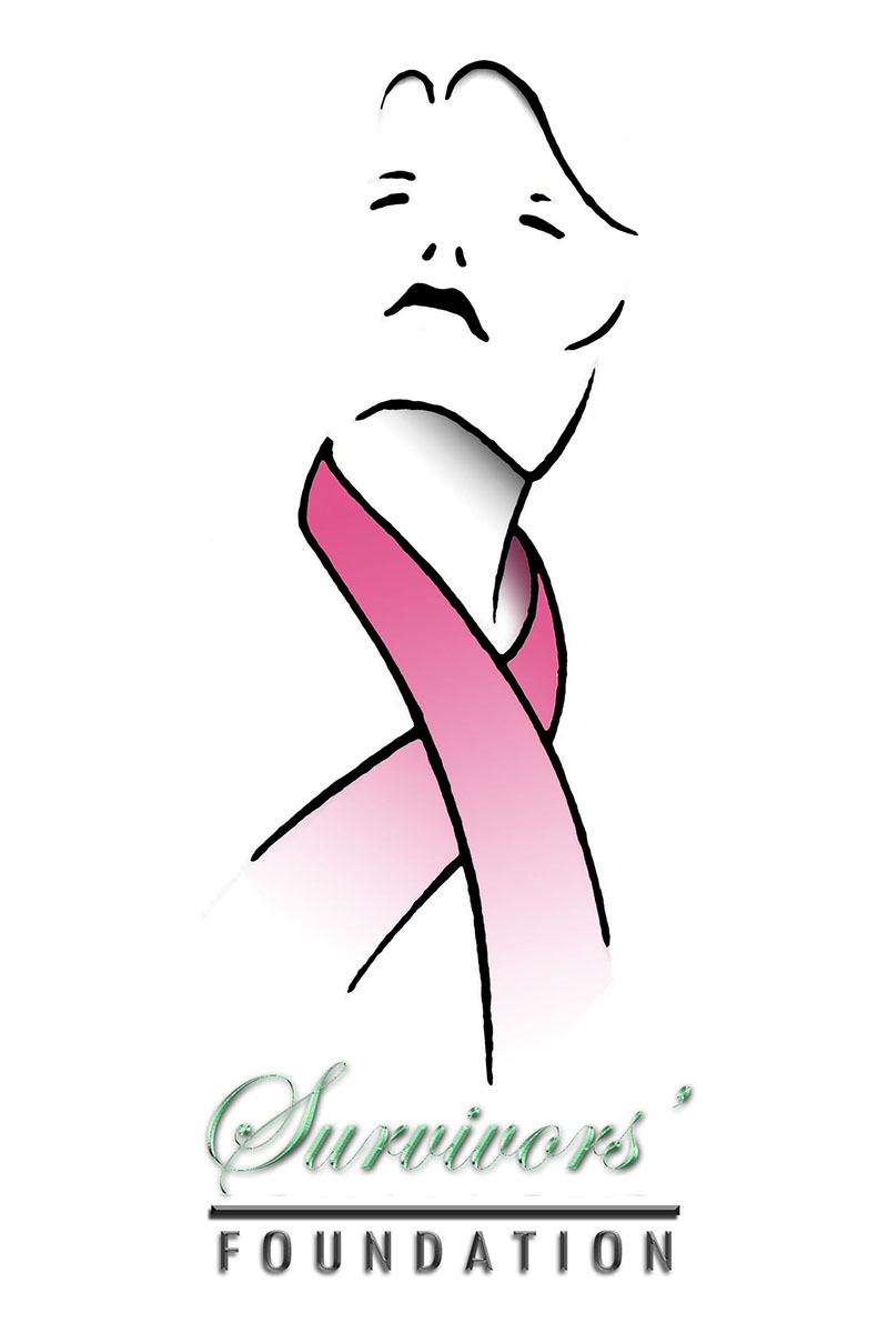
I wanted the symbol to be uplifting and empowering, so I depicted a moment of a woman with her chin up, despite adversity. Originally, her fist was raised above her head, but I felt that it was more of a distraction.
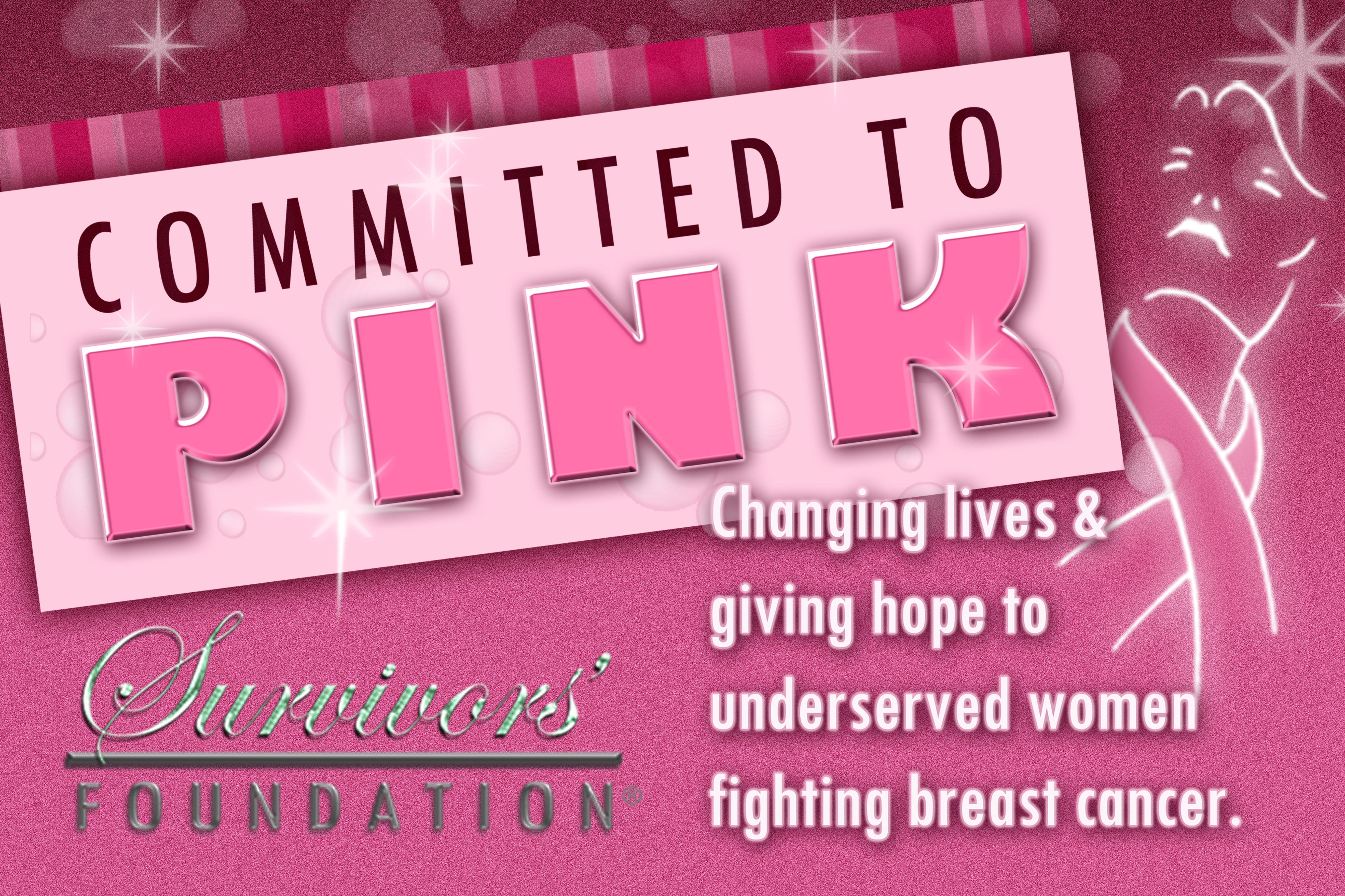
Along with this particular brand, they really specified that they’re color story was pink with a pinch of green. Pink representing Breast Cancer awareness and the green to represent the monetary “pinch” of donations. They also emphasized the brand was to be described as feminine, soft and loving.
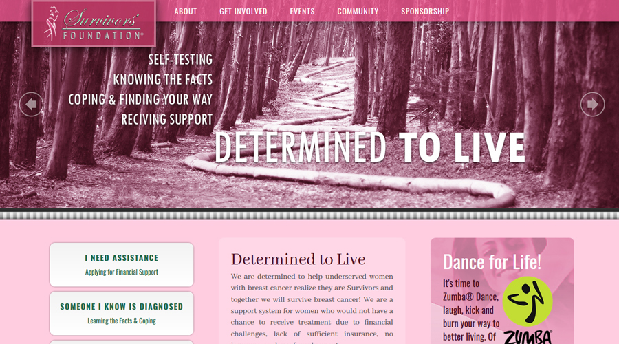
I had a blast creating and maintaining this website. Check it out, it has its own page.
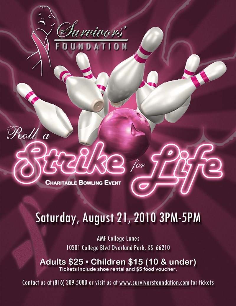
This flyer was to invite the public to a charitable event. I wanted to give it a 70s feeling, classic bowling alley theme completely color blasted in pink. I used this mini-logo on the event tickets and eBlasts.
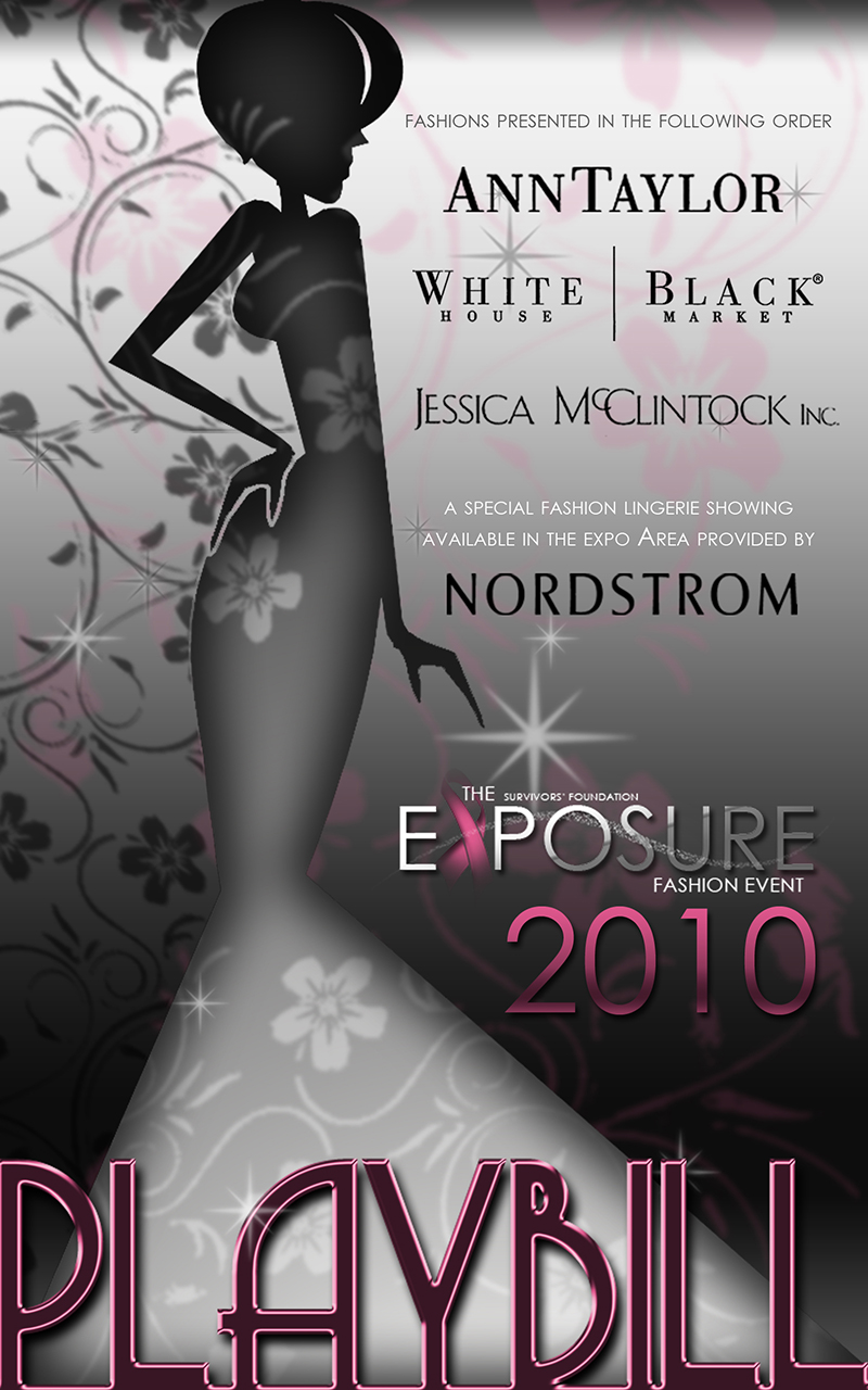
This is the organization’s biggest event of the year. It’s a black-tie affair with a four-course meal, a fashion show, and then a small exposition of the companies that sponsor the organization.
The use of the silhouette significant because I actually designed the stage for the show, as well. I used a series of screens for the models to pose behind along the runway to cast larger-than-life impressions of the ladies. Looking up, being positive and stylish were among the true goals.
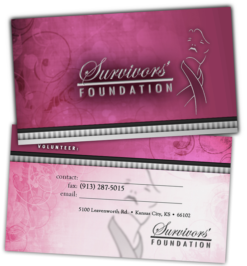
What better way to echo the brand throughout with professional business cards? Think pink, soft and loving.
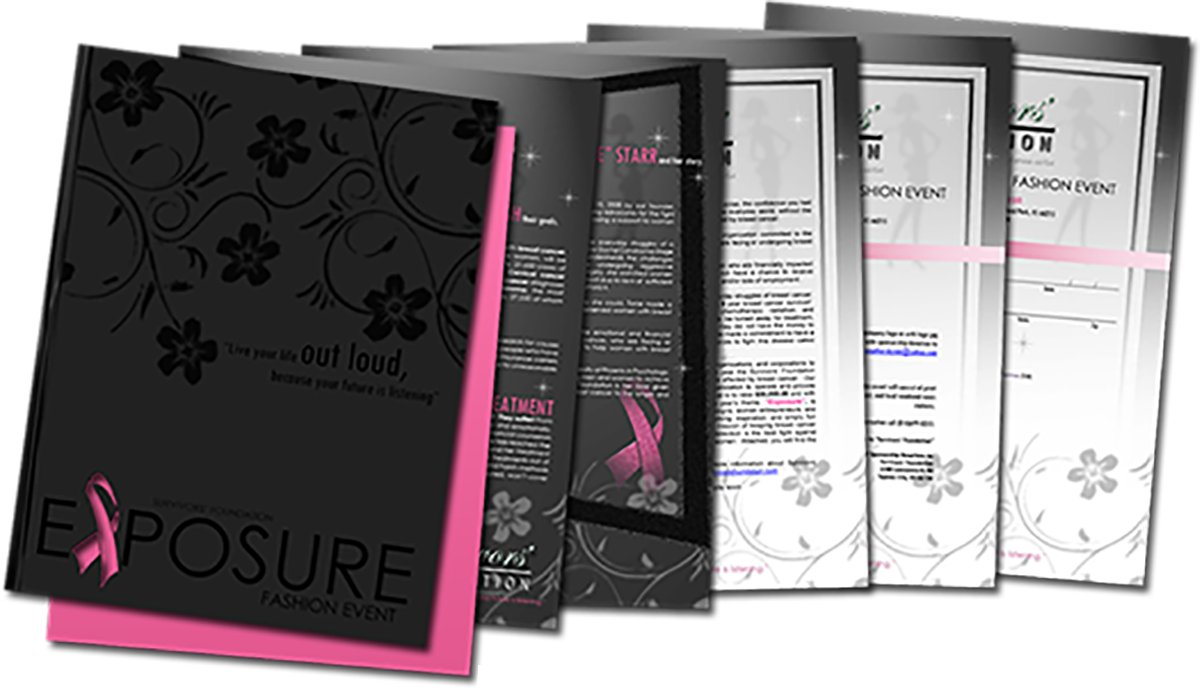
I was up for hours cutting the ribbon shape out of all of the charcoal paper covers for all 88 folders! Yes, that is black ink on charcoal paper. They came out fabulous, however. And they earned sponsorship from every request of whom they sent this presentation.
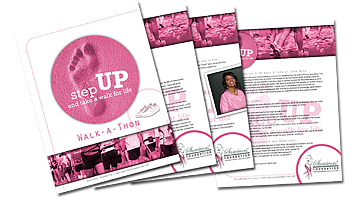
Step-up was a marathon, and the idea was to make an impression…foot in the sand, easy right?
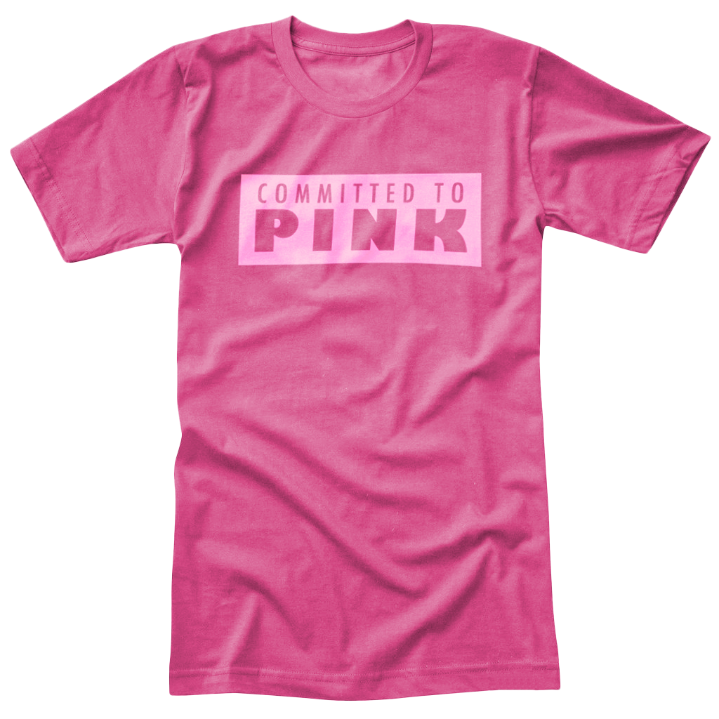
This event was outdoors so I chose to use a light pink t-shirt. I was into parent color on color, so bright pink stamp on a pink shirt, made them surprisingly easy to see.
Along with the t-shirts, they waved this poster at the carwash to attract cars and quickly inform.
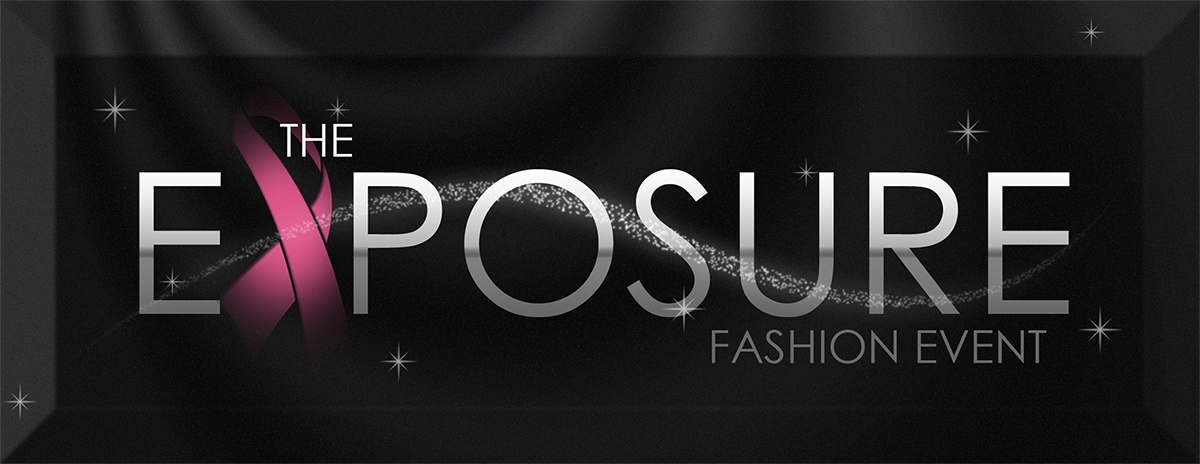
This is my favorite mini-logo because it incorporates fashion and graphic art. They sold tons of this ticket.
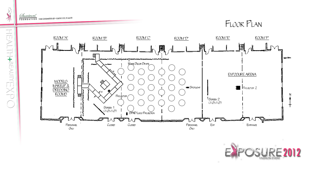
This was my second runway design for the Exposure event, and of course, I wanted to do something I thought no one had seen before. The stage company welcomed the challenge for another great show.
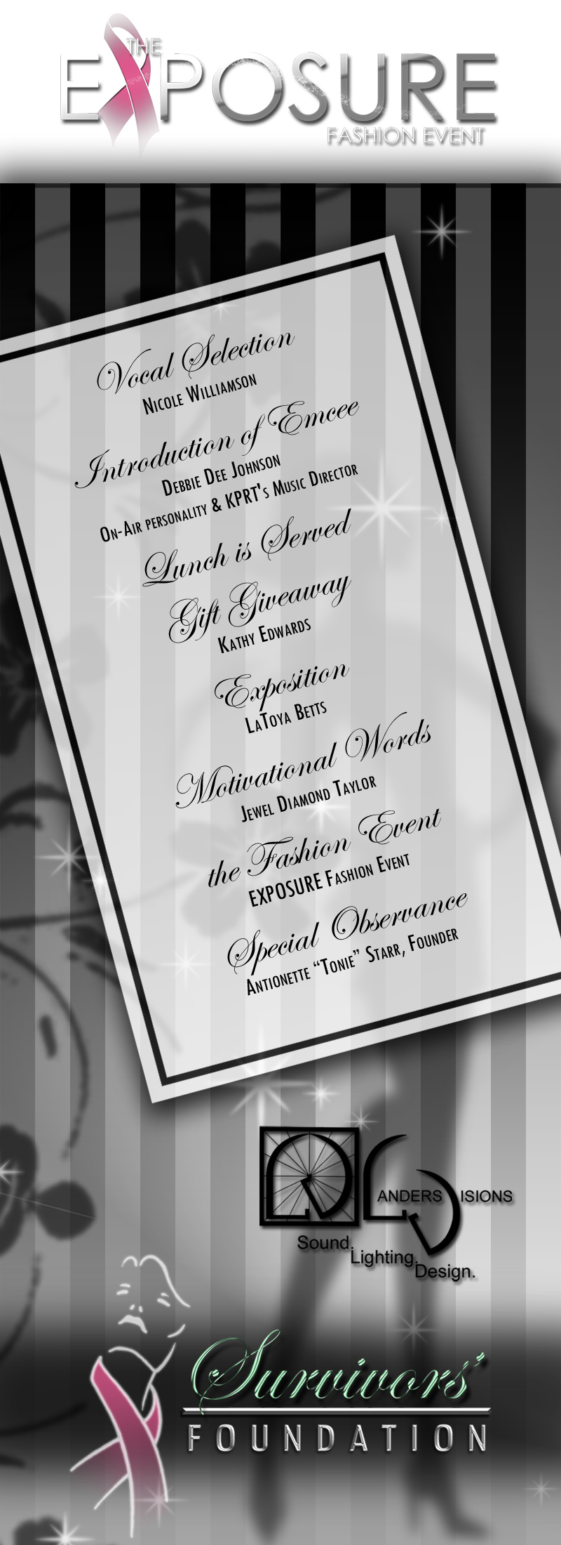
Black-tie event agenda design.
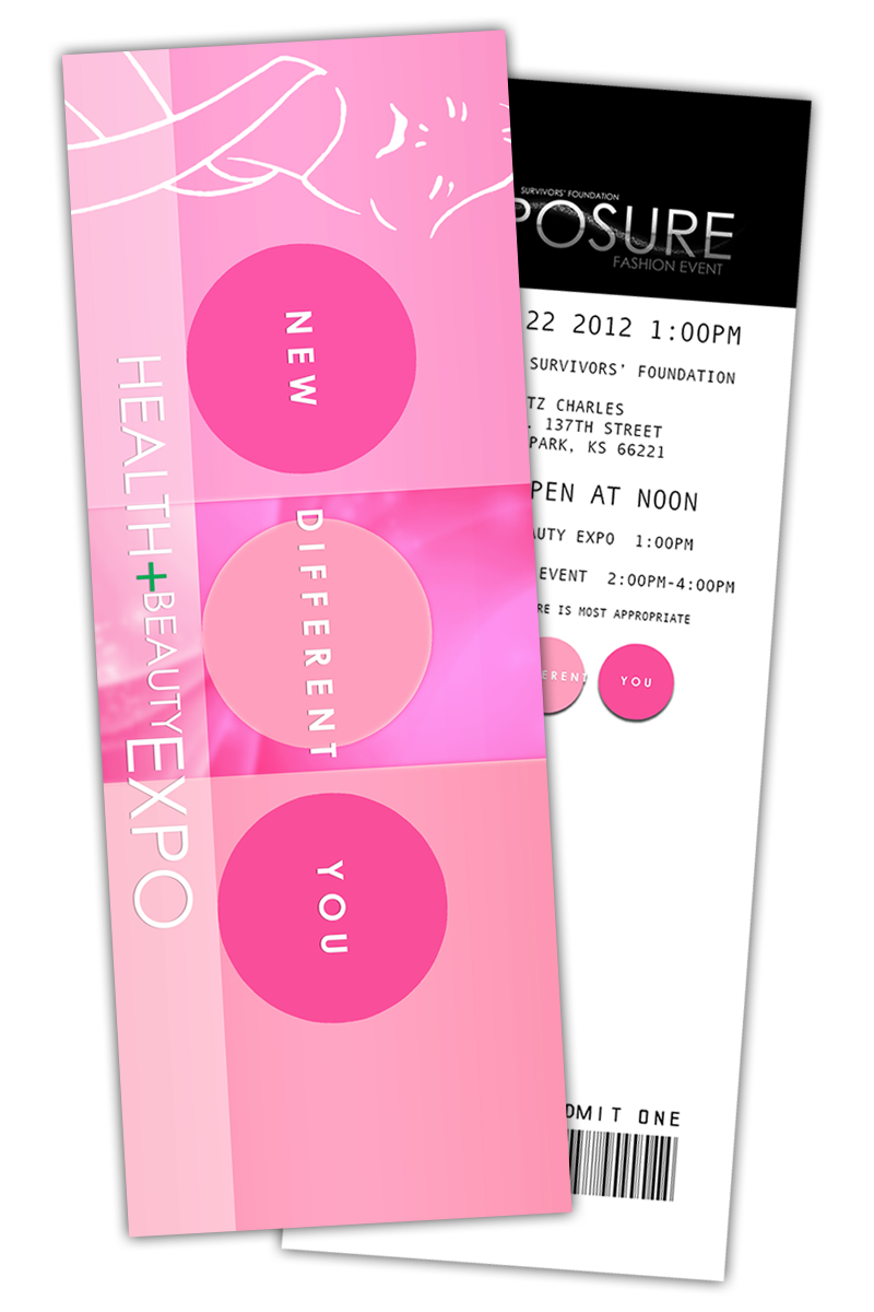
The second event admit-one ticket design.
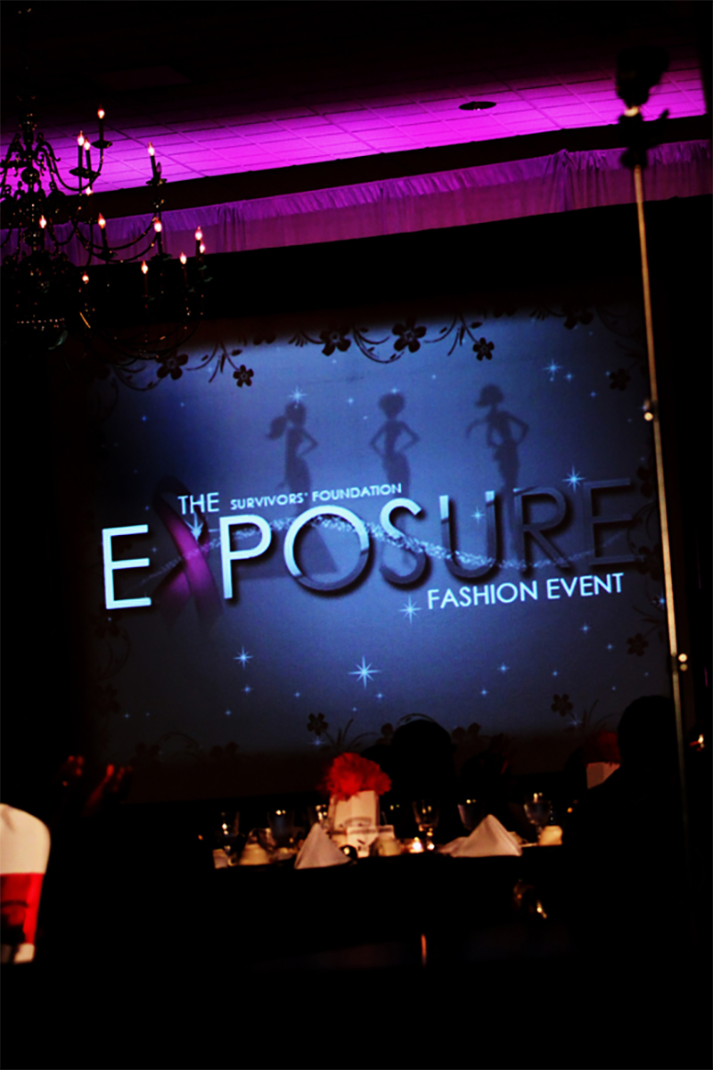
This is a shot from the event from the stage looking at one of the silhouette screens with the mini-logo projected across.
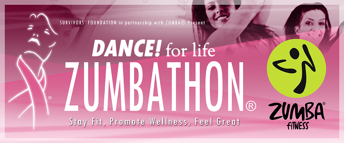
The organization teamed up with Zumba for a fun event that would include exercise and awareness. This is the vinyl poster they asked me to design (30"x72").
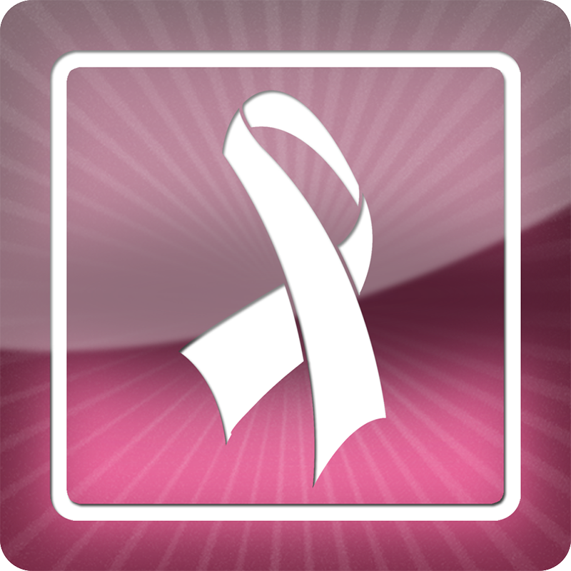
The organization's official icon design.
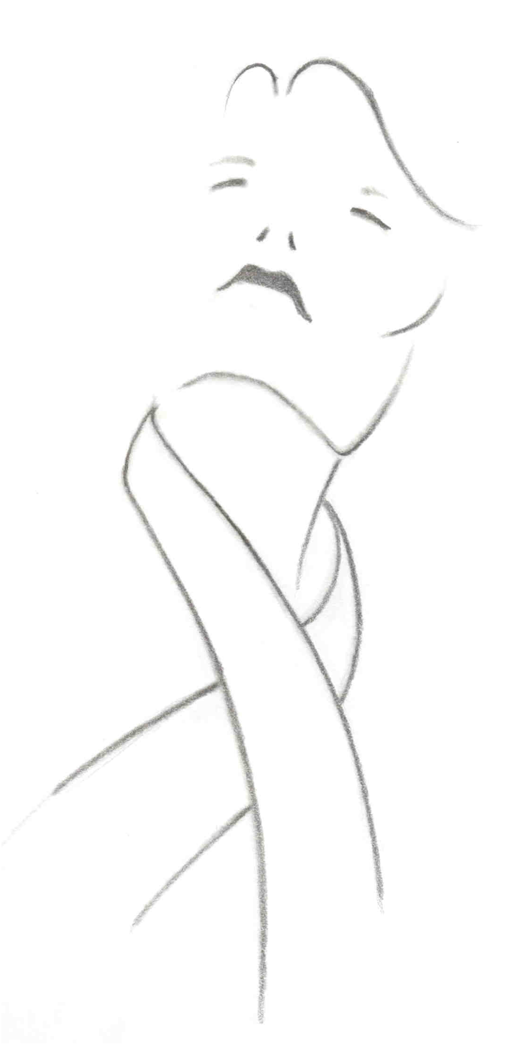
This is the original sketch of the logo, graphite on 70lb. paper. “Survivors.”
 Website
 Flyer
Flyer Business Card
 Proposal
 T-shirt
 Extras