Chicago based web designer & illustrator. I create and build websites for people and brands. I am available for freelance, just get in touch with me.
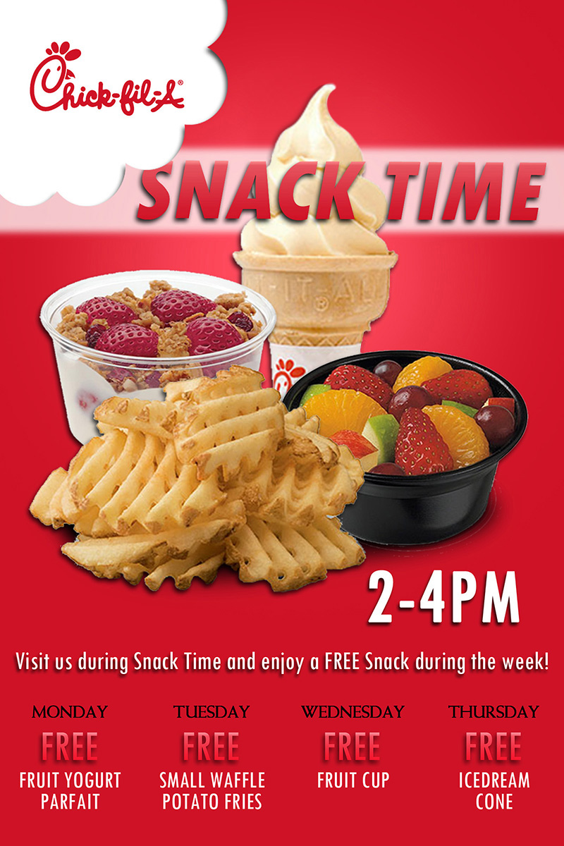
No, this wasn't my very first ad ever, but it was my first ad that I was licensed to use photos from the corporation. Along with it came official instructions of how to use tradmarked images and maintain their standard, so much fun for me! A big name, professional standards, I was living!
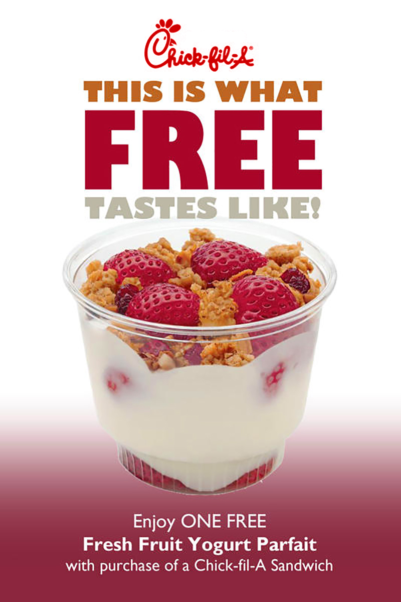
I thought the image of the berries was so alluring that I wanted the hue of the berries to be echoed throughout the ad. I wanted to tell a simple, easy-to-understand story while showcasing the product.
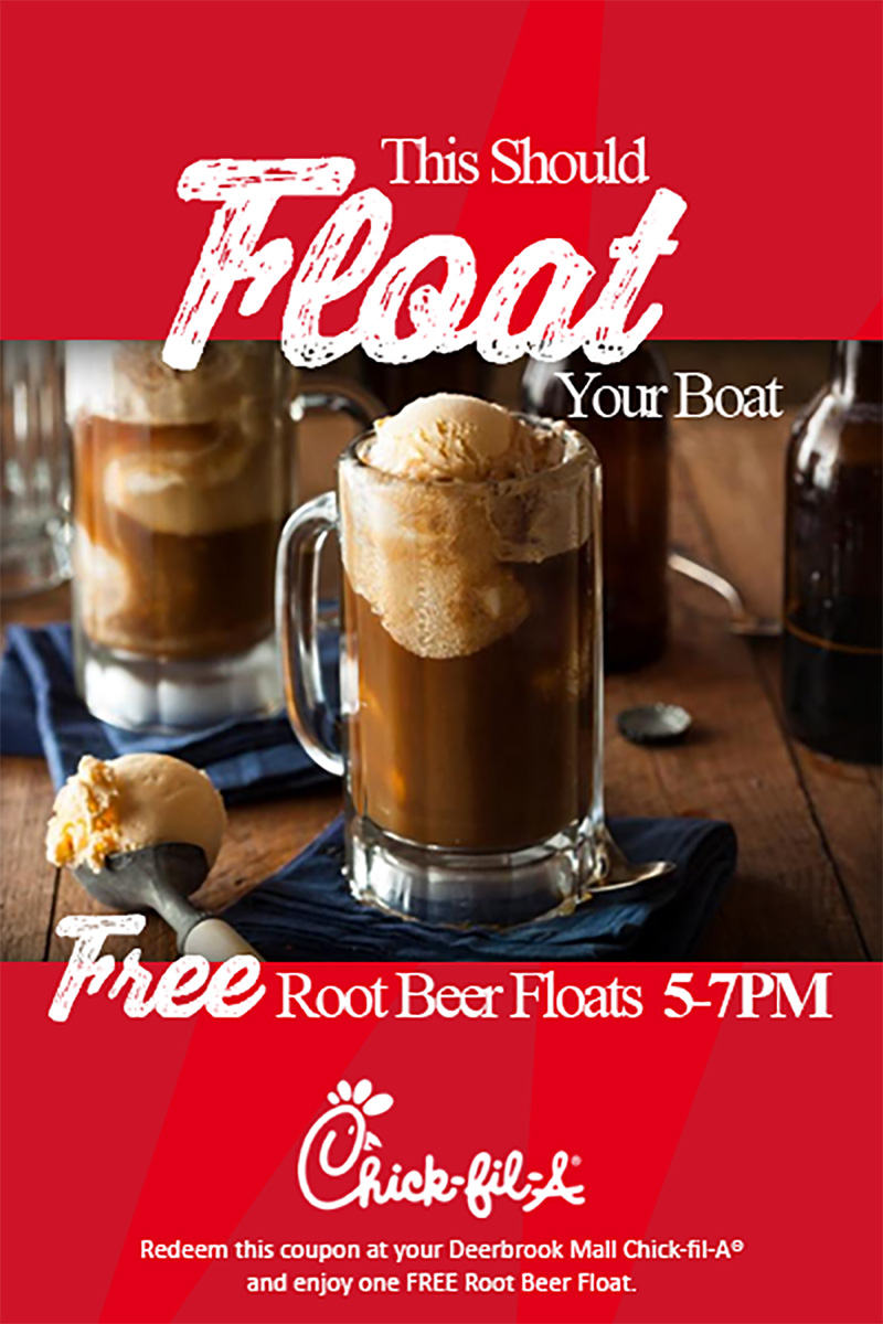
By now, I understood more about what the client liked, splashes of the brand color with quality imagery. A little bit of sweeping brush typography to give a small glimpse of summertime chalkboard specials, and presto! Summer in a cup.
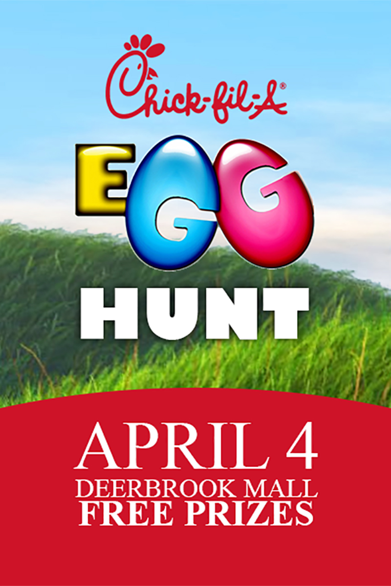
So this time, I just wanted to use the actual shape of eggs to make a bright, uplifting symbol that could be easily recognized. Saturated grasses against a rich sky says springtime to me.
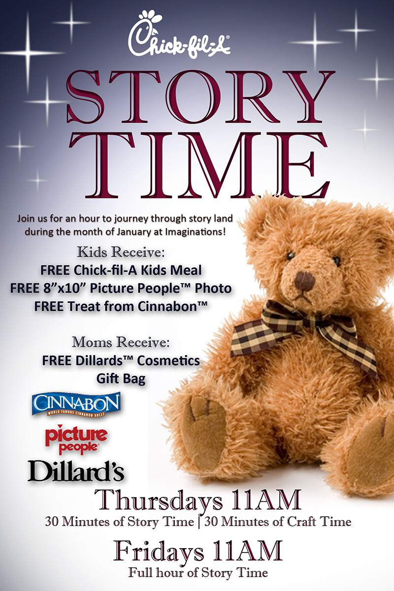
This was one of those age-old challenges, the battle for real estate. The client just had a lot to say, and it required extra logos. To keep it easy to read and appealing from a distance, I added the fuzzy bear and the title against a stary night. The story of reading fun stories and reading children to sleep, maybe noon nap for the little one and Mom can enjoy a quick break…at least that’s where I was going.
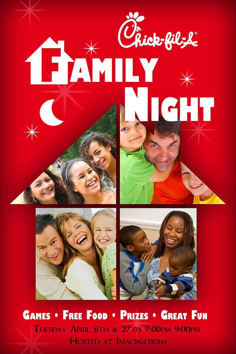
We wanted to show everyone’s family, happy and enjoying leisure time. I repeated the family theme with a house/home silhouette, which then gave plenty of space to incorporate the brand’s trademark color.
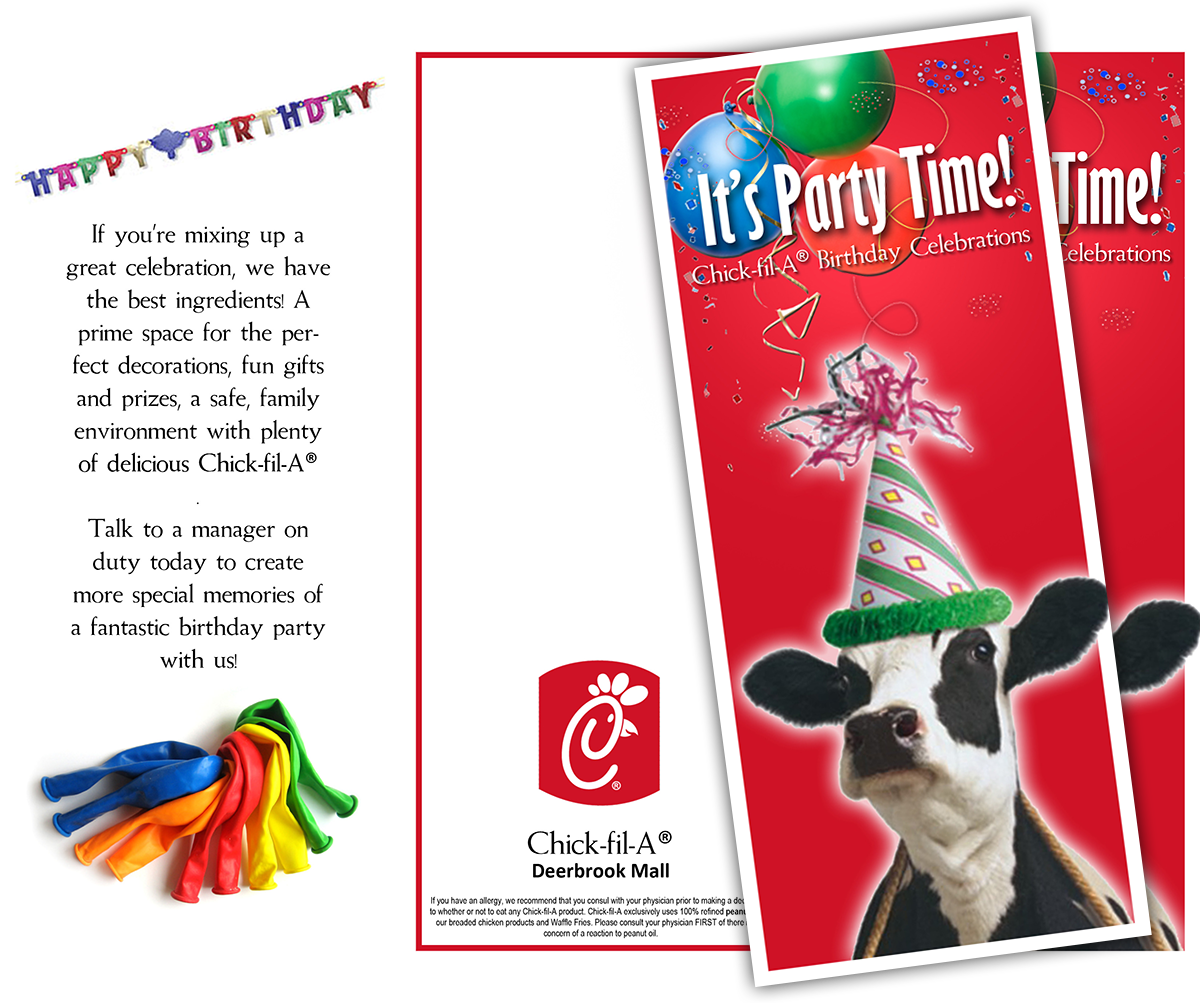
This brochure was so much fun because it was my first time getting to use the cows! A fun pamphlet with the bright brand’s color and trademark animal! I decided to keep the brochure simple and let the cows be the star, I mean they looked like they were having a good time.
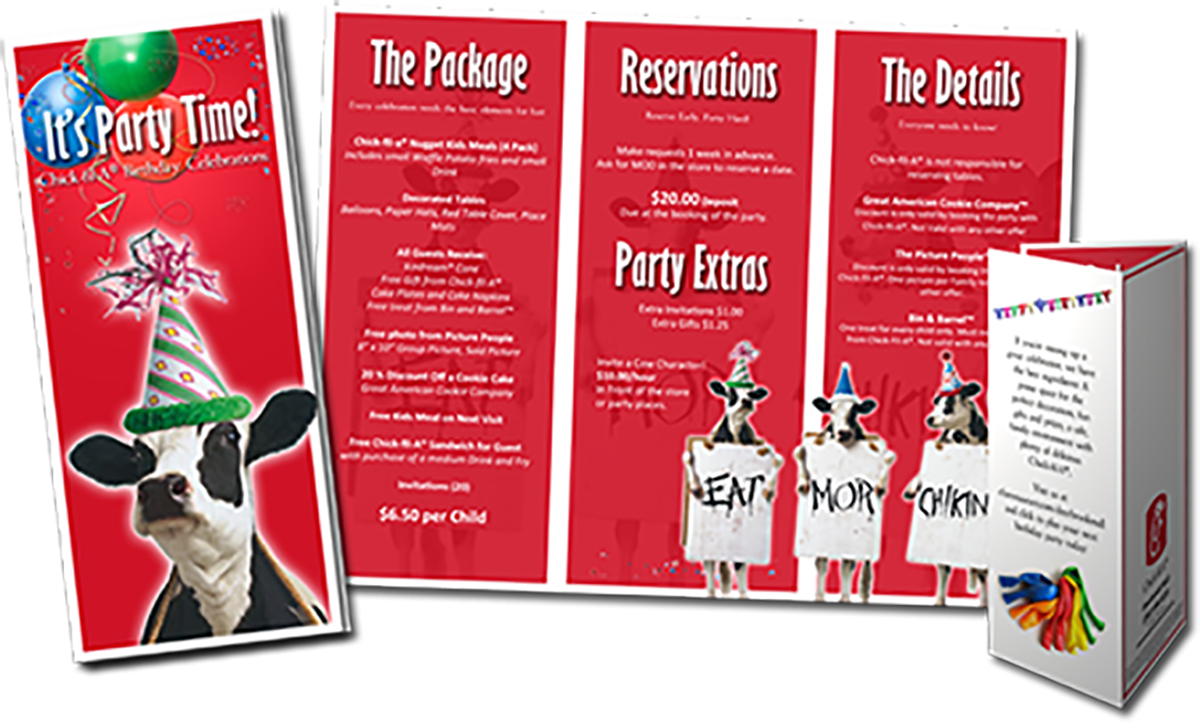
This is the inside of the brochure. A lot of the required verbiage was varied for different stores and specific events so I left a lot of space for the text to change while keeping it easy to read.
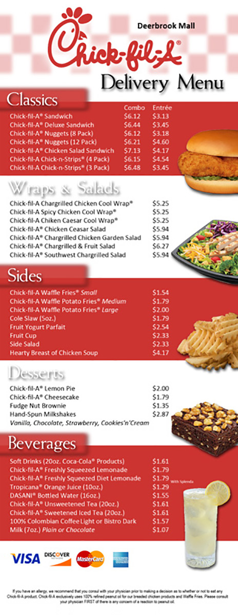
This was another chance to use trademark images of the product, really entice the eye. Even if you weren’t thinking about lunch, you will after you see this. Keeping the company brand’s colors in mind, it sold itself.
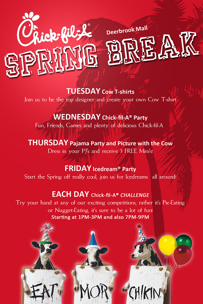
I couldn’t help myself, I loved any excuse to use the cows throwing a party.
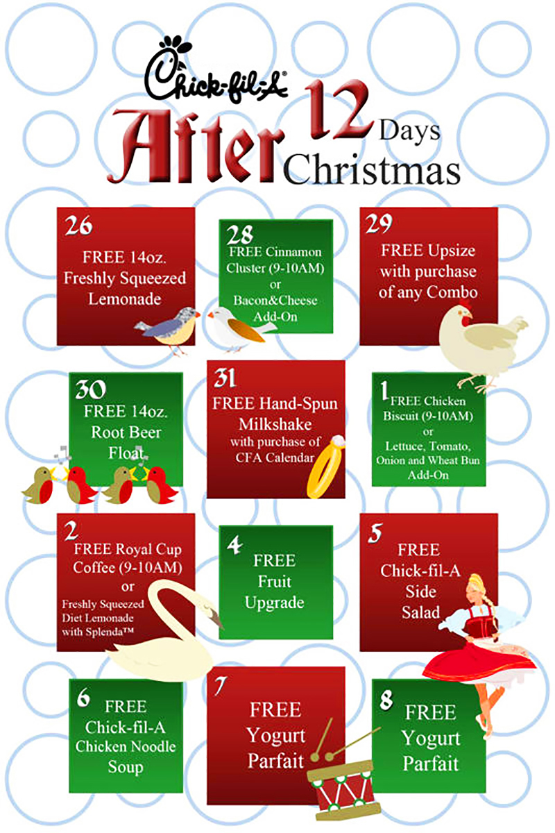
I actually had to look up the lyrics to the carol and then I incorporated some of the characters. I wanted to create this kind of calendar grid with the actual dates of the specials. Fun and functional.
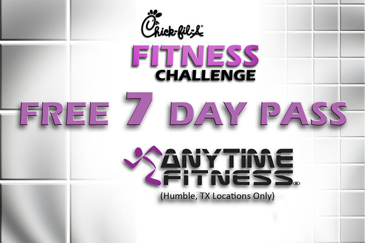
So I decided to flip it, make the logo neutral and then use the partner’s brand colors. The fuchsia color stood out from the gray; leap into action and reach those New Year goals.